OVERVIEW
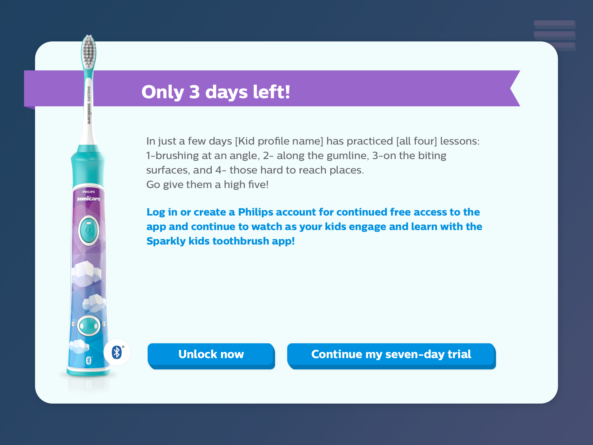
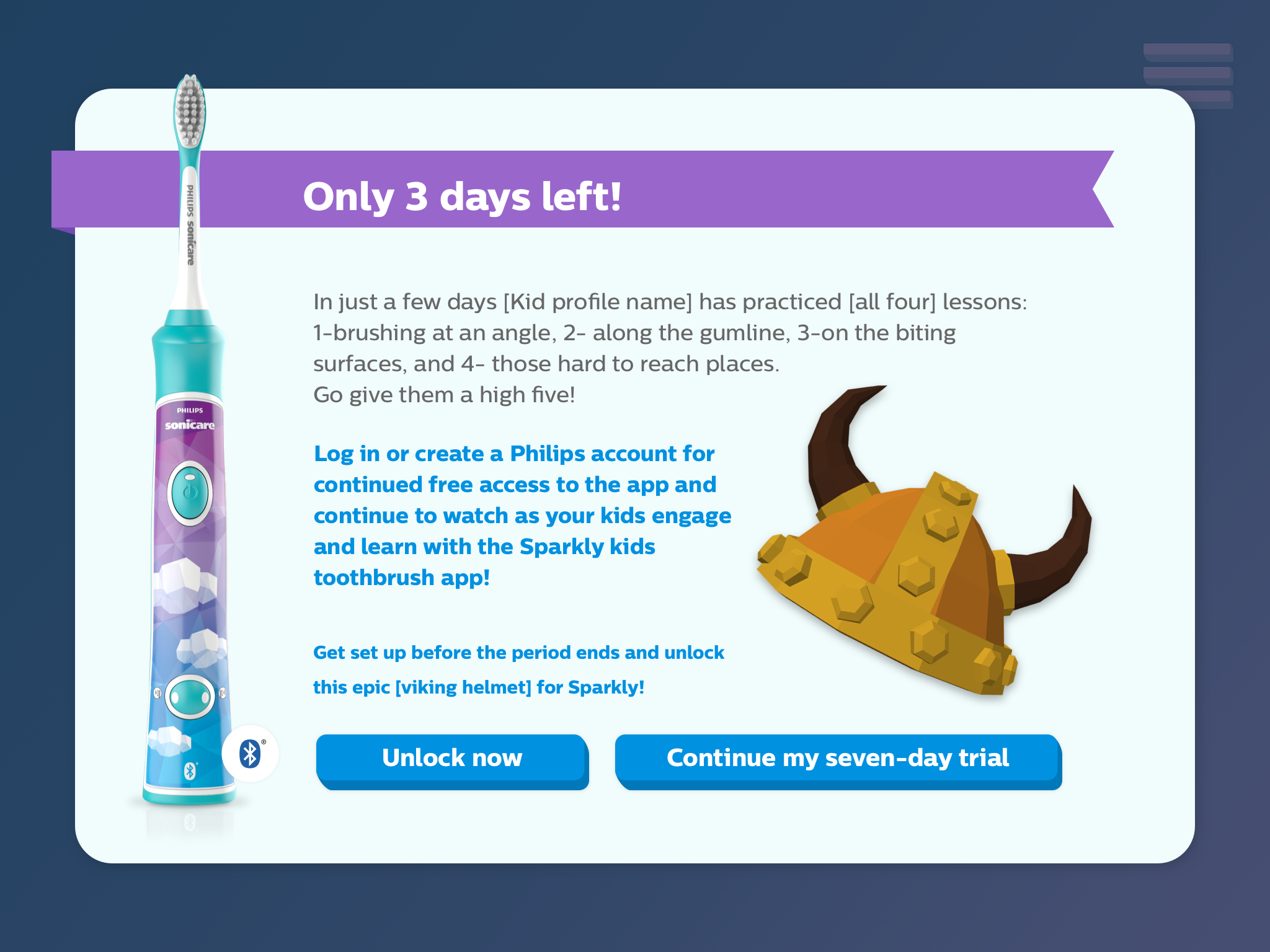
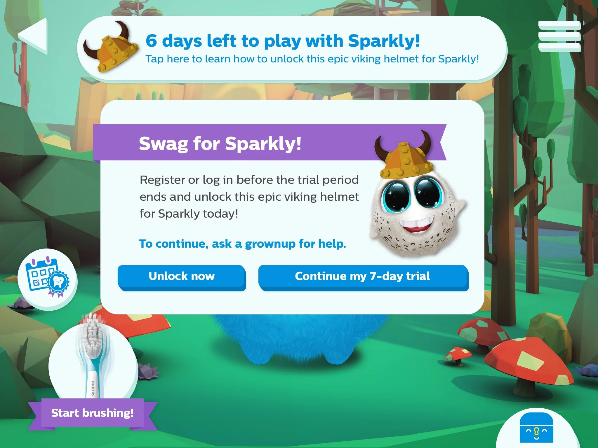
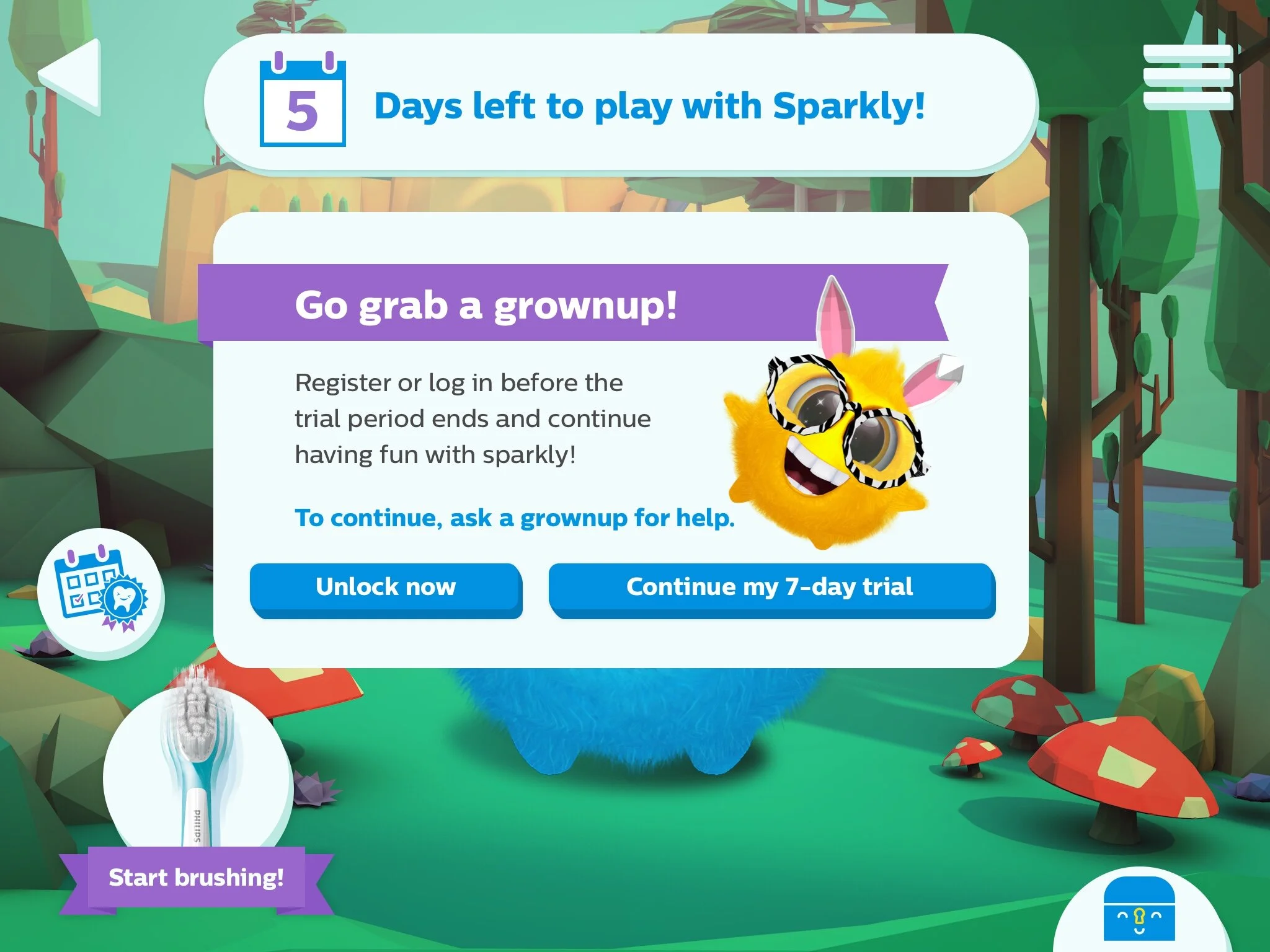
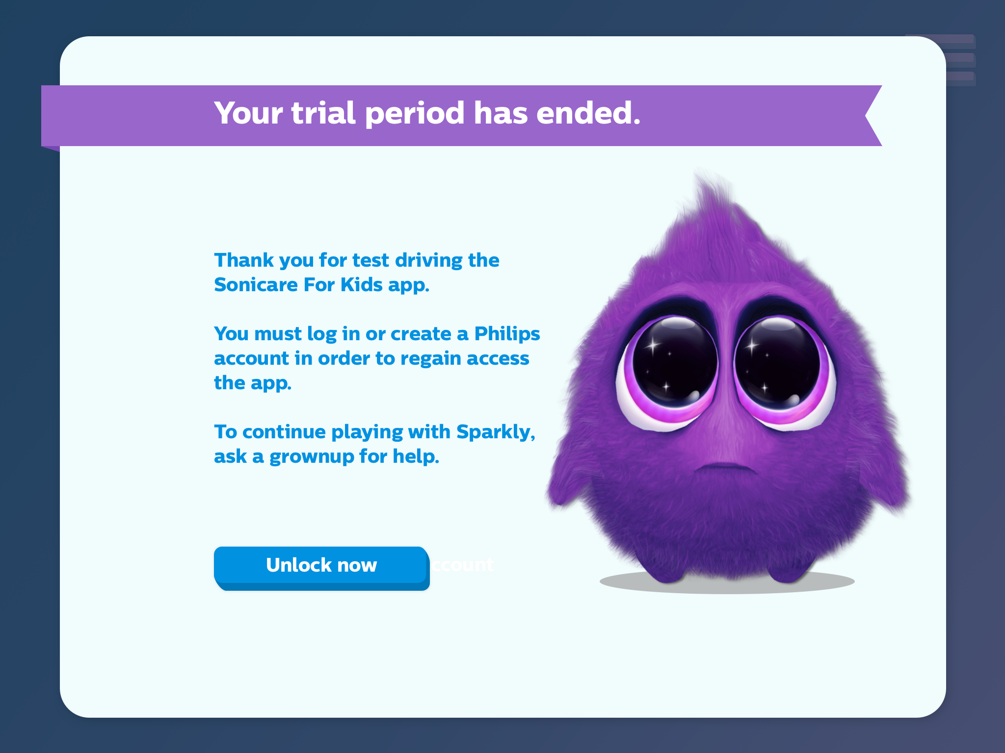
Philips wanted to explore a new onboarding flow for their Philips Sonicare app to increase user signups. The signups would allow Phillips to directly communicate with users regarding future benefits and other product offerings.
PROBLEM
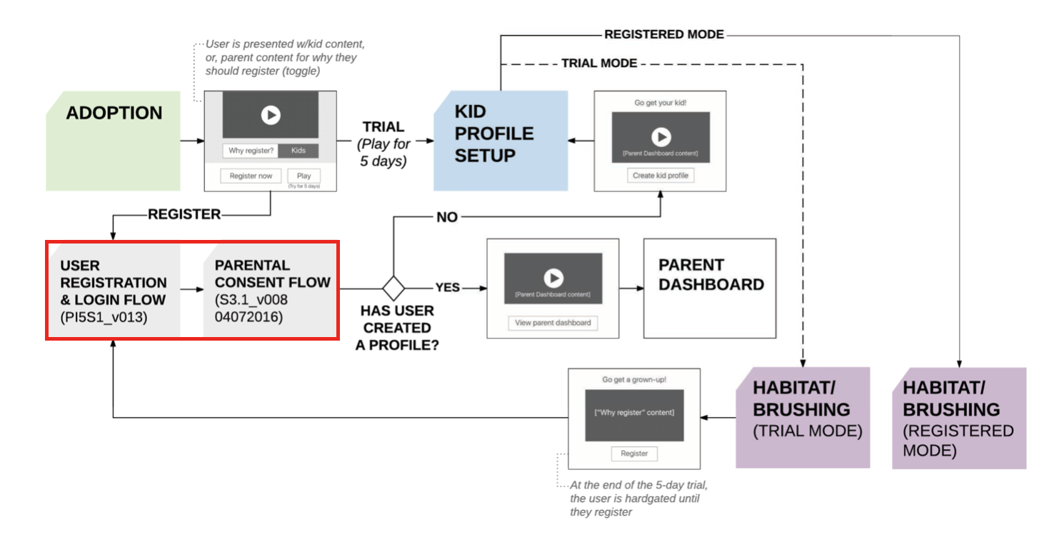
There are 2 very distinct users for the onboarding flow. End users of this app are kids aged 4-10, however, there are steps as part of the registration and onboarding which an adult/parent has to complete. This makes designing the experience of the flow challenging as the design (elements, look and feel) and the copy (tone, seriousness, complexity) need to change accordingly.
SCOPE:
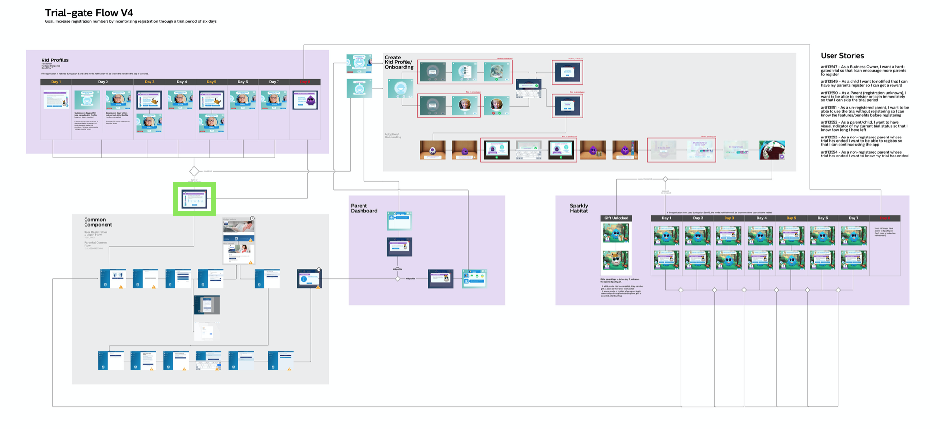
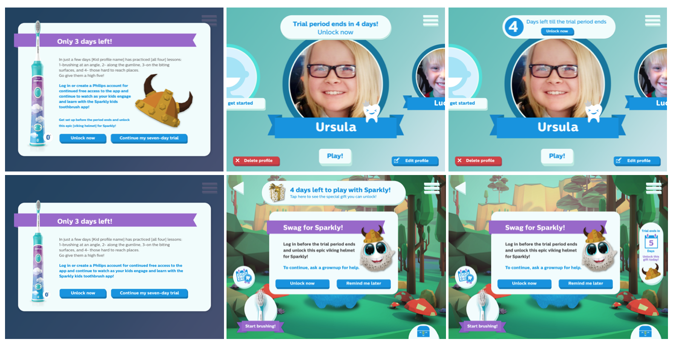
I was tasked to explore different variations of the on-boarding experience and login flow based on user stories that had already been finalised.
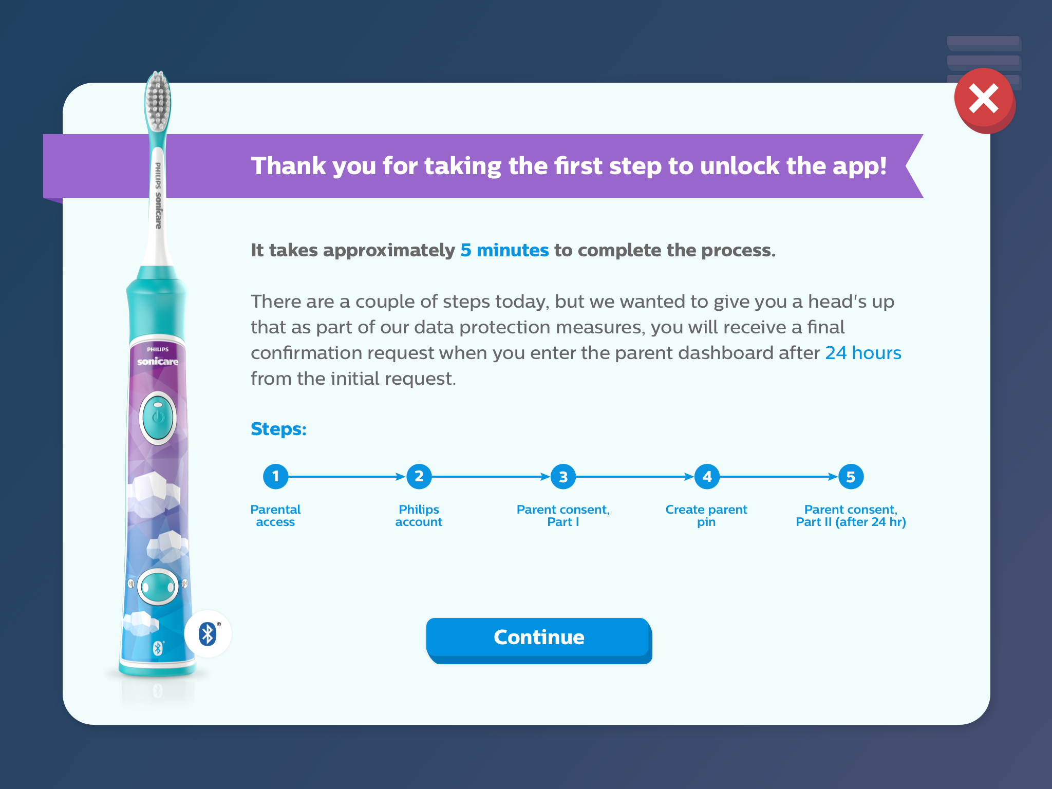
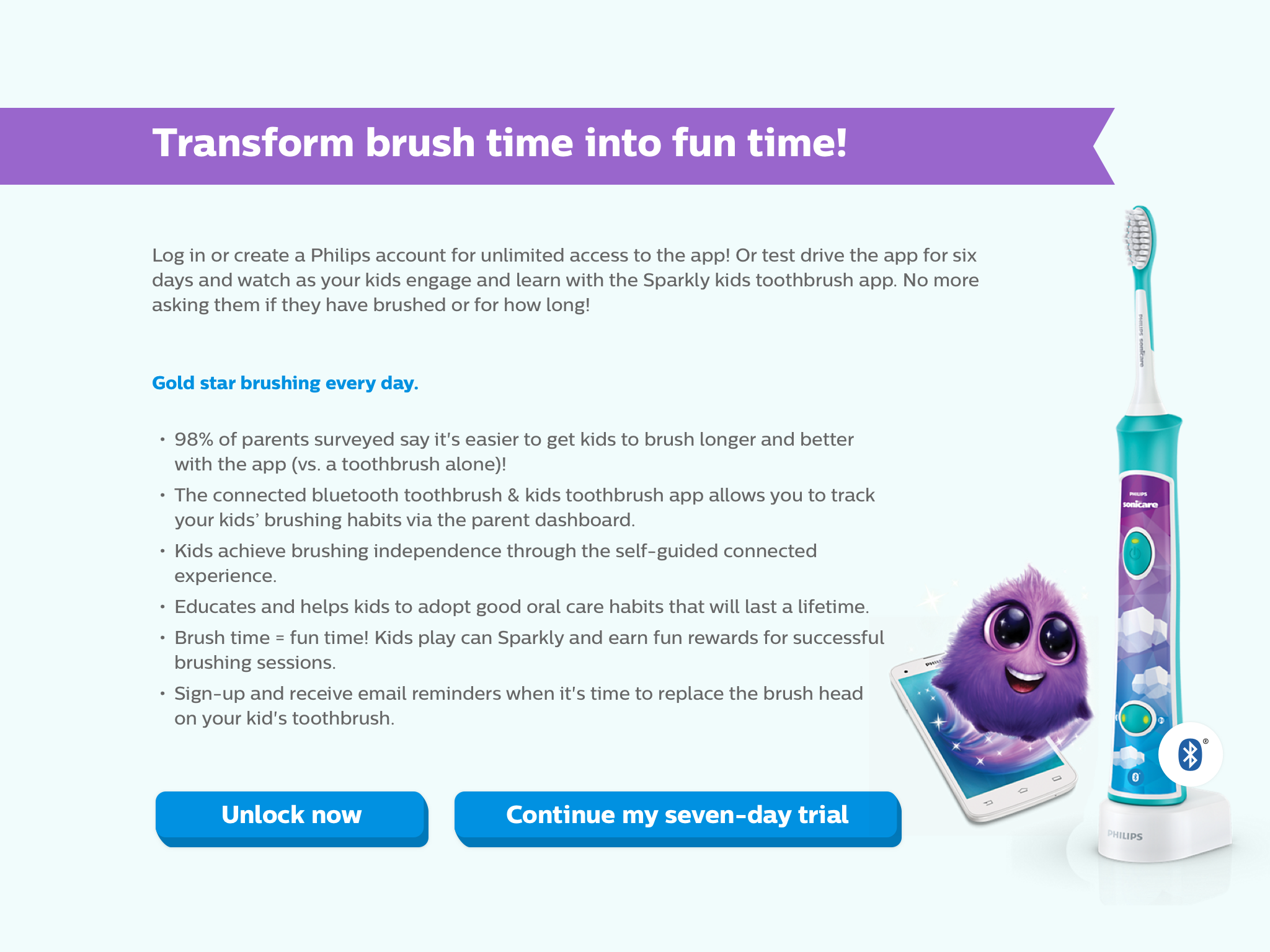
The scope also included designing new screens and modifying some existing screens with new elements.
For research purposes, iPad was used as the base platform as data shows it is the most popular platform.
The final deliverables were high-fidelity prototypes in proto.io, to be tested by the Philips research team.
DESIGN DIRECTION
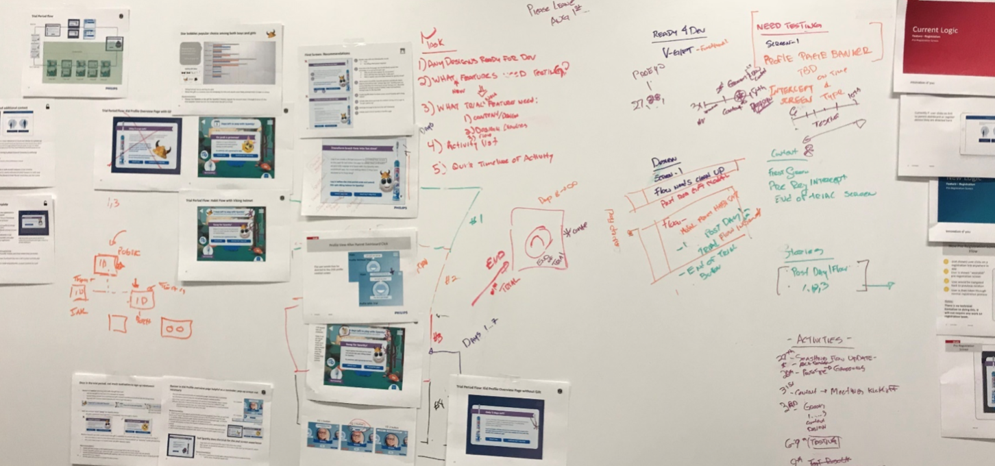
PROCESS
5. First round of TESTING (Philips research team)
6. Incorporating FEEDBACK from testing
7. New SCREEN DESIGN
8. PROTOTYPING for second round of testing.
1. Define DESIGN GOALS based on user stories
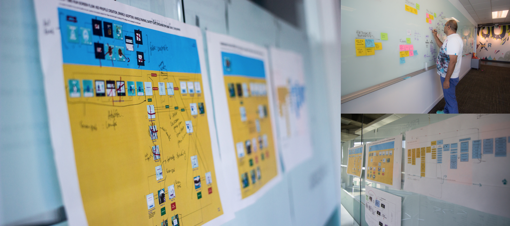
2. Map out NEW FLOWS to achieve design goals
3. Flow REVIEW with Philips team
4. SCREEN DESIGN VARIATIONS for 3 prototypes to be tested
CHALLENGE
A big chunk of the flow is “common across all Philips devices” and centrally controlled. This takes away control from individual product teams on a large part of the flow.


